


 88cm by 25cm")
")


 7 Sisters Retro T-Shirt - Personalise Your Year")


It’s important sometimes to look at the artwork that is being printed, before selecting the t-shirt colour that you would like, just to make sure it works.
The example images below will hopefully explain this.
IMAGE 1:
This is an example of a design available in our ‘Non Military Range’
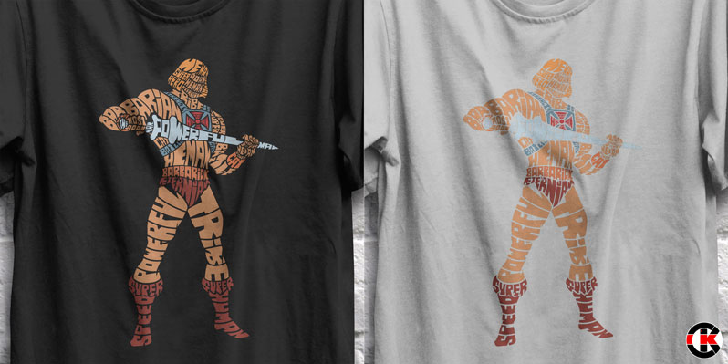
The image on the left is the design on a black t-shirt, the image on the right is the same design on an ash grey t-shirt.
You can see that the black t-shirt works well but the lighter colour does not work at all.
IMAGE 2:
The only way for this to work on a light colour such as ash grey is to put a black background around it.

Some people just place a block colour behind it, it works, but we reckon it’s a little lazy – this is shown in the image to the left.
The image to the right shows how we would print the design, if a light colour is required, to make sure it works. We create a ‘stroke’ edge around the design to make it look neat but also stand out.
Hopefully this will explain the importance of colour when choosing your t-shirt colour. Many of our designs are noted for the recommended colours in the description but if you’re in any doubt, please drop us a message or click on the ‘ask a question’ (red question mark) button on any product.
Related Products
 He-Man, Calligram (Mug & T-Shirt Package) 20% off!")
Leave a Comment